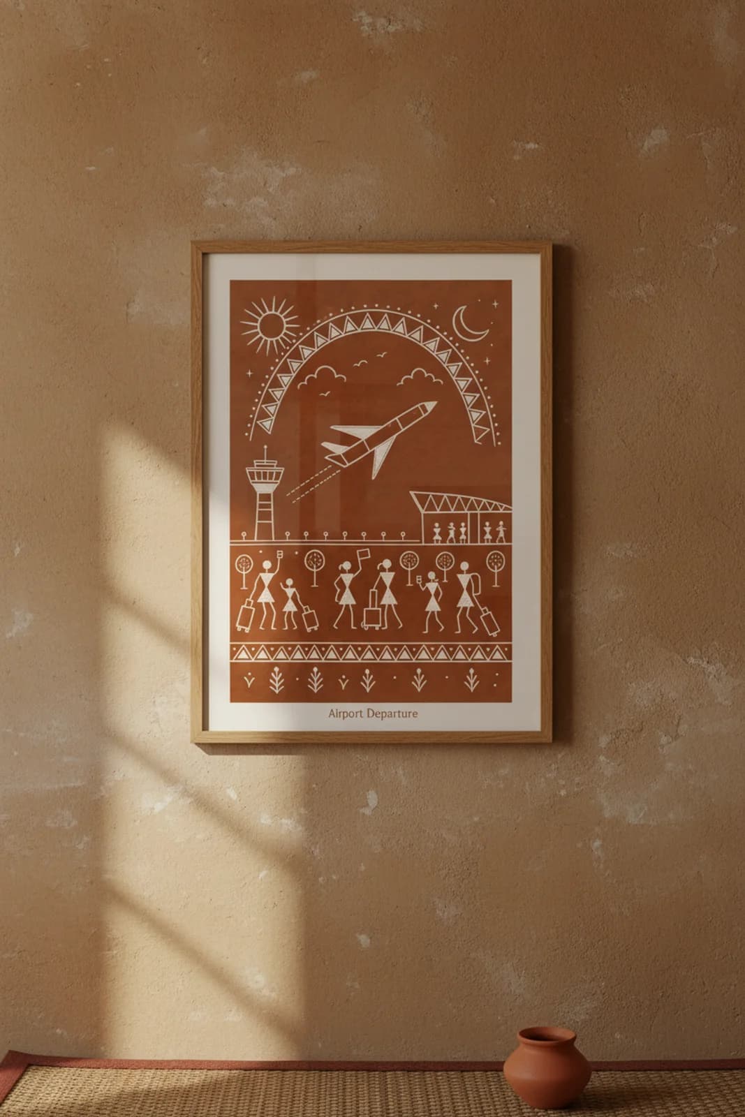
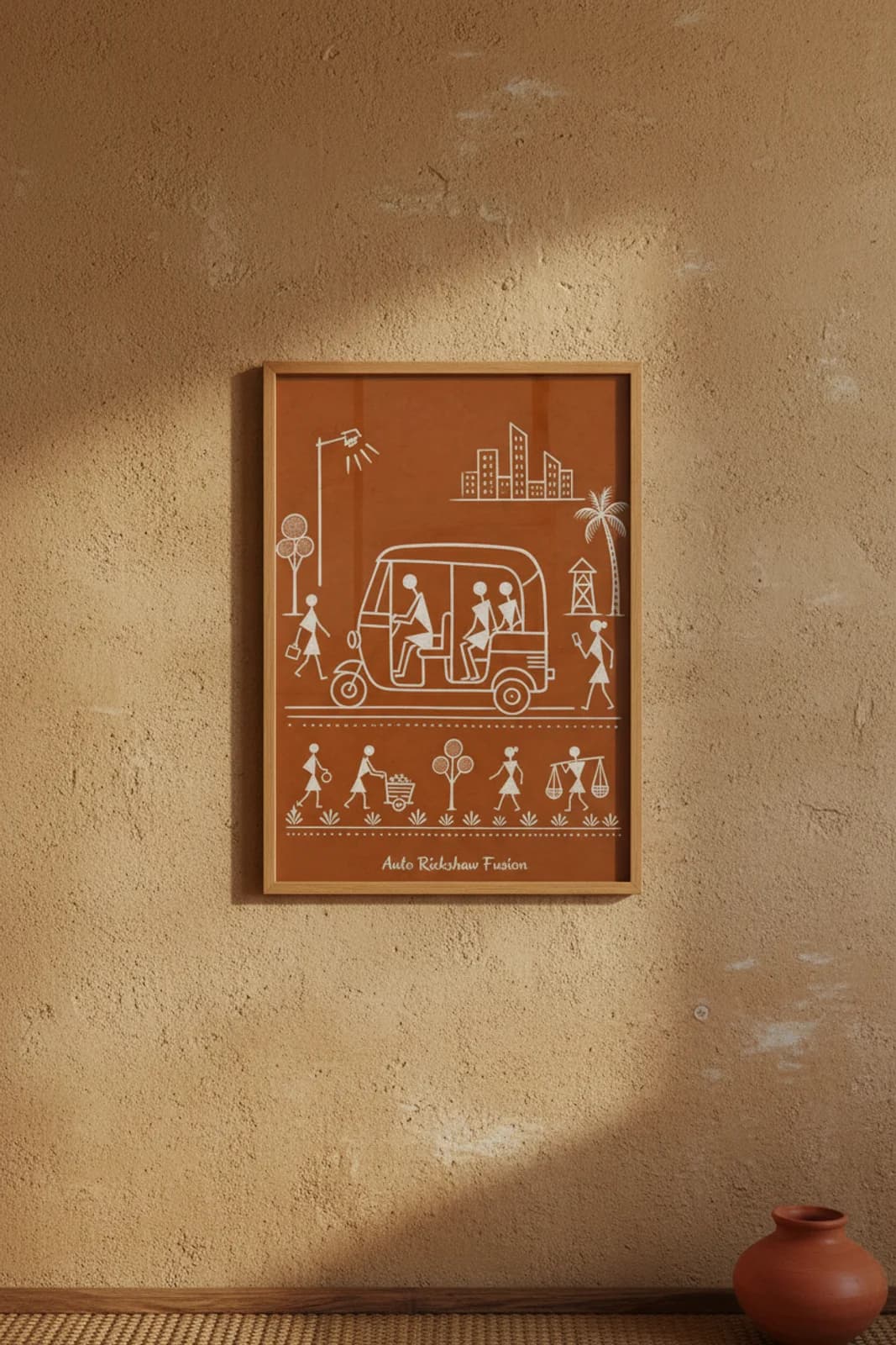
The brief was a translation problem, not a travel poster: how does a Mumbai airport takeoff — metal bird, lattice tower, rolling suitcases, boarding-pass rectangles — read inside Warli white-line grammar without breaking monochrome discipline or smuggling in a tarpa dance spiral that belongs on harvest nights, not runways? Sun-moon-arch symmetry was the layout fix. Classical Warli uses the celestial band for marriage chauk and seasonal rites; here the same double arc holds both sun and moon because long-haul departure collapses day into night before you reach baggage claim. The airplane is deliberately not a realistic silhouette — fuselage as stacked rectangles, wings as triangles, ascent angle fixed by dashed motion lines trailing behind, the way Warli hunters once showed running deer. What we refused: perspective depth, airline logos, jet-engine detail, any multicolor fill. What we kept legible: control tower lattice left, runway light dots on sticks, terminal zigzag roof right, and the lower-band procession of triangle travellers with square luggage — the village walking line grammar applied to T2 chaos. The bottom triangle frieze and plant-grain band re-anchor an aviation scene inside wall-painting border tradition so the piece stays Warli first, CSIA second.
 WALLIMILIST