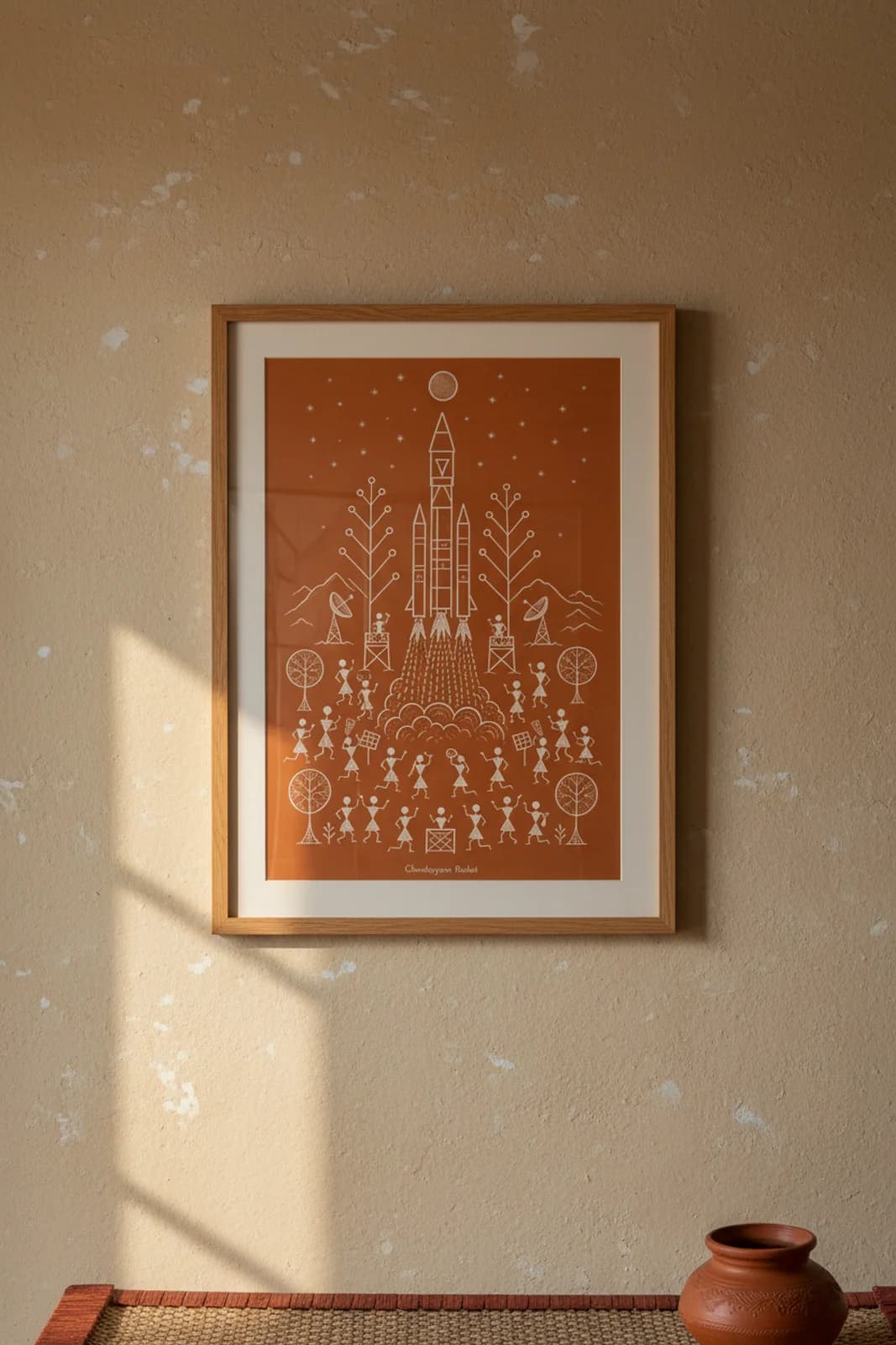
The brief was a translation problem, not a space poster: how does a cryogenic multi-stage rocket — asymmetric boosters, mach diamonds, fairing seams — read inside Warli monochrome grammar without looking like a NASA sticker pasted on a mud wall? Vertical-axis symmetry was the layout fix. A launch vehicle cannot sit in a horizontal harvest band or a tarpa spiral, so the rocket climbs centre-column from pad smoke to moon circle while witnesses fill only the lower register. What we refused: photoreal engine bells, ISRO logotype, perspective depth, and the tourist-poster habit of crowding sun, moon, huts, spiral, and chauk into one frame. What we kept legible: triangle nose cone, twin booster wedges, dot-dash flame grammar, scalloped exhaust cloud, and that full moon as destination disk — the same circle vocabulary Warli uses for tree crowns and festival drums. The crowd is not filler; it is the communal witness layer Warli always paints around transformation — here the transformation is lift-off, not wedding or harvest, but the stick-figure grammar stays identical.