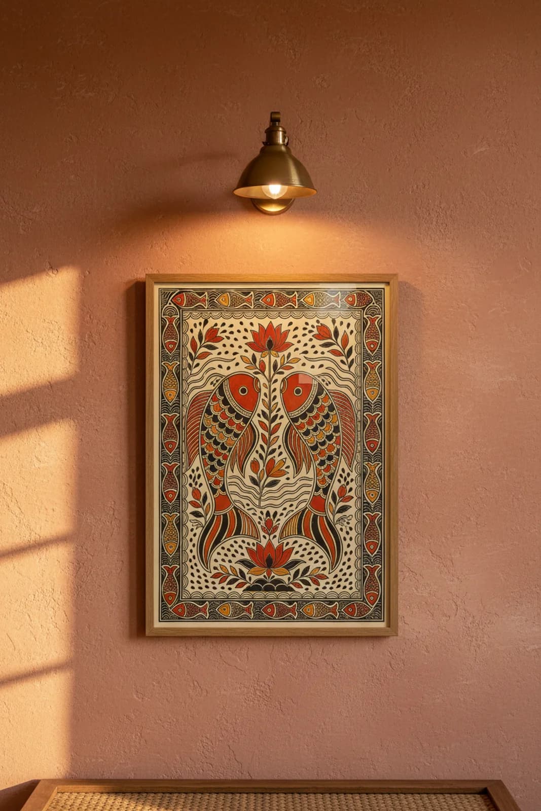
The brief was deliberately narrow: one classical subject, one symmetry axis, zero narrative clutter. Paired fish are among the oldest auspicious marks on Mithila walls — fertility, abundance, the pond-fed life of the region made legible in contour. Horizontal-bilateral layout was the structural choice because fish naturally face each other across water; a vertical mirror would fight the swimming gesture. Bharni carries the read at poster scale: vermillion and ochre flat fields inside confident double outlines, with scale texture built from repeated semi-circles rather than photographic detail. The central lotus stem is not filler between the fish — it is the third axis, linking upper bloom to lower seat the way Kohbar wedding panels pair aquatic life with floral prosperity symbols. Rice-grain teardrop dots and wavy current lines fill the negative space so the cream ground never reads empty, matching the horror vacui discipline of village wall painting. What we did not add: deity figures, text bands, or fusion street subjects — this stays river-first, ritual-second, room-third.