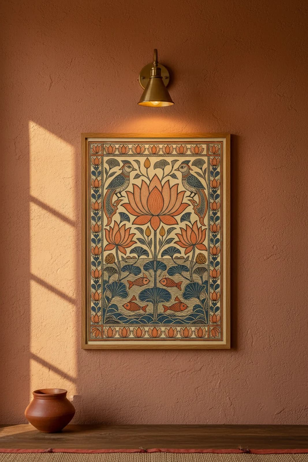
DESIGN BRIEF: A lotus pond in Kachni should read as texture before colour — if the water becomes a blue wash, the whole panel forgets Kayastha line discipline and starts looking like generic folk clipart. Horizontal-bilateral symmetry solves the layout problem: one vertical stem anchors hero lotus, side blooms, and pond fish on a single mirror axis so the eye travels crown-to-water without chasing diagonal narrative. I kept the pond zone in the lower third only — parallel wavy line ripples on cream, no pigment fill — because Darbhanga Kachni panels treat water as negative space bounded by hatch, the way rice-paste Aripana treats floor geometry as outline before ochre dust. Terracotta ochre carries the lotus and fish as restrained Bharni fills inside Kachni shells: petals get parallel hatch, fish scales get diamond cross-hatch, but the field never floods vermillion. Inward-facing birds at the crown borrow Kohbar wedding-wall vocabulary without importing bridal-chamber narrative — they simply guard the bloom the way parrot pairs guard Kohbar ghar walls. The lotus-band border repeats upright flower cells alternating indigo vine scrolls so the frame rhymes with the hero motif instead of importing fish-border or peacock-arch grammar from another catalog entry.