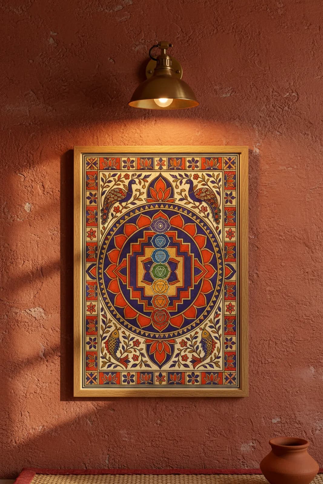
DESIGN BRIEF: Yoga-studio chakra posters usually flatten the stack into a wellness infographic; Tantrik Madhubani refuses that read. The layout problem was stacking seven distinct colour fields vertically without breaking fourfold symmetry — Darbhanga yantra grammar solves it by treating the chakra column as the central axis inside a rotational lotus frame, not as a left-aligned chart. Each chakra medallion gets its traditional hue and internal geometry — hexagram at Anahata, square at Muladhara — while stepped rectangular yantra bands wrap the column the way Sri Yantra nests triangles inside lotus gates. I chose fourfold rotation over pure vertical bilateral because the catalog brief demanded lotus-petal cells at the border and peacock-fish corner guardians; those figures need equal quadrant weight, not a top-heavy column floating in cream. Peacocks crown the field as rain-and-beauty sentinels facing inward; paired fish anchor the base as matsya abundance symbols — standard Mithila corner grammar borrowed from Kohbar panels but stripped of wedding narrative. Vermillion and indigo dominate the border lattice per classical Tantrik palette, while the chakra stack carries the full spectrum so each energy centre reads at a glance without a caption. Bharni flat fills carry the medallion colours; Kachni hatch texture lives in fish scales and peacock breast patterning only — line density where the eye rests, flat colour where the mantra needs silence.