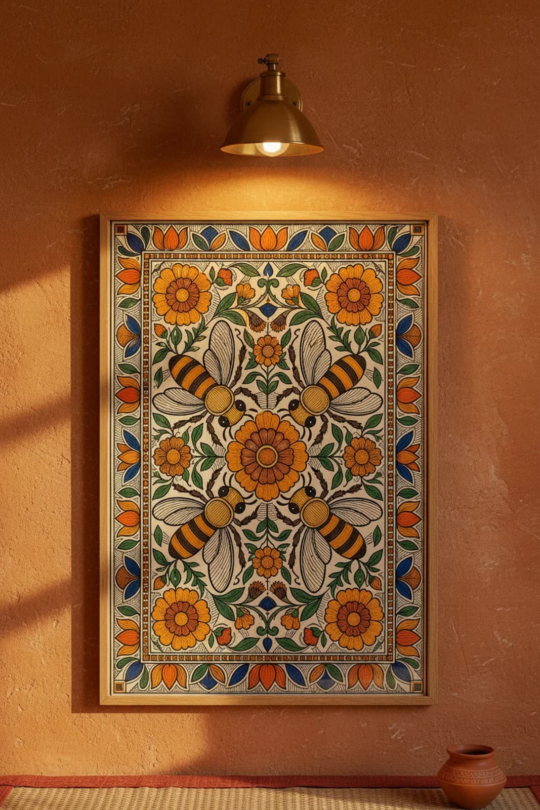
DESIGN BRIEF: A pollinator panel only works in Kachni if the wing veins and petal hatching share the same line rhythm — otherwise the bees read as stickers dropped onto a Bharni colour field. Fourfold-rotational symmetry solves the layout problem: each bee occupies one quadrant at equal rotation, all heads and abdomens angled inward toward the central marigold bindu so the eye tracks a clockwise garden orbit without a narrative left-right bias. I chose marigold orange and turmeric yellow as the dominant fills because Ranti Kachni spring panels traditionally pair bright floral grounds with sparing indigo accent — the cobalt blue diamond lozenges on the vertical and horizontal axes act as rangoli anchor points, not decoration. Corner marigold blooms mirror the central flower at reduced scale so the rotational grid stays legible when the print hangs at dining height. Line hatching carries the texture burden: wing membranes, petal surfaces, and the main border cross-hatch ground all use parallel strokes at consistent density, while flat colour blocks stay bold inside lampblack outlines — the Kayastha Kachni compromise between line discipline and festival warmth. The outer lotus-petal border band repeats at four-way intervals so the protective frame echoes the central flower geometry without importing Kohbar wedding narrative.