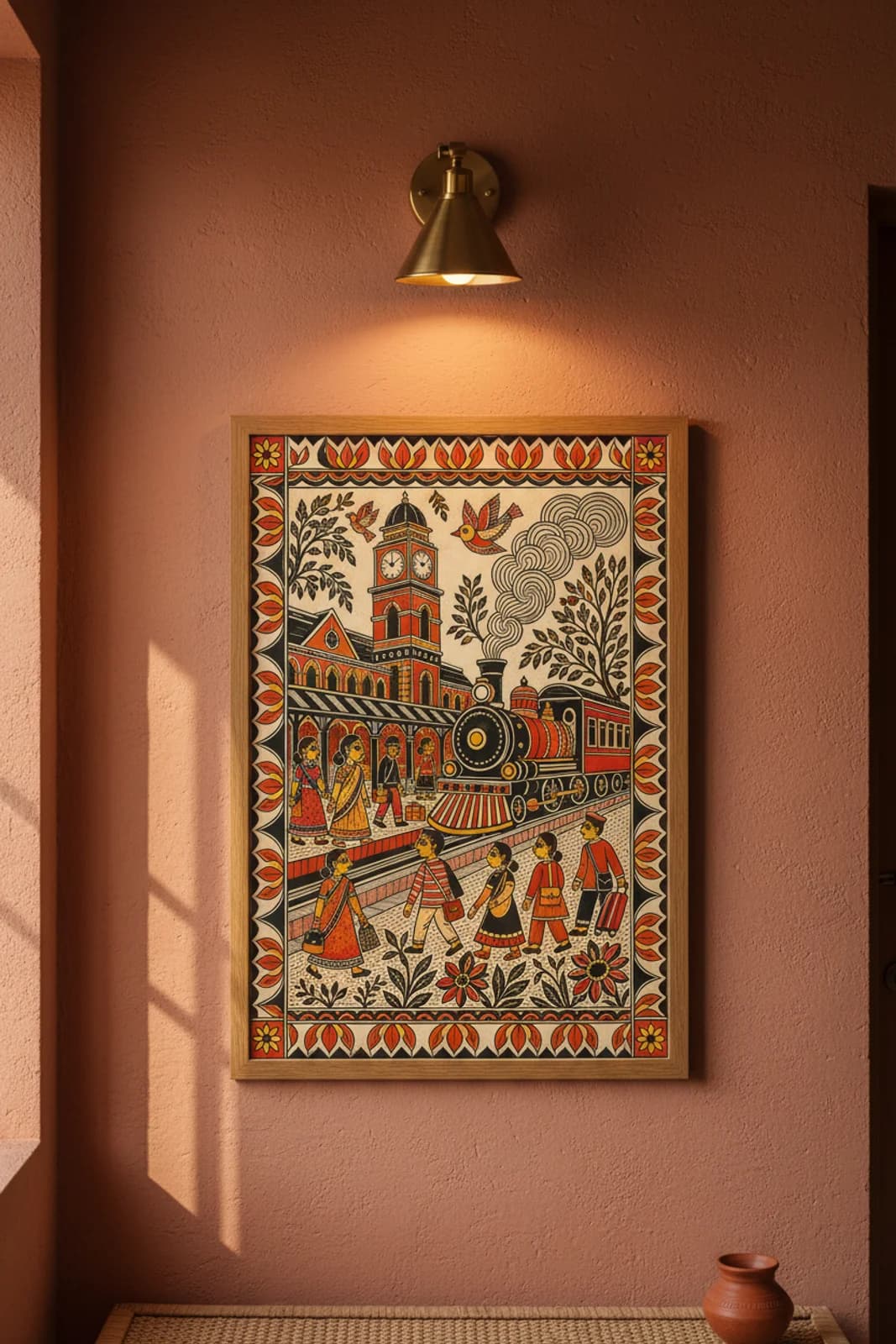
DESIGN BRIEF: The brief was not to paste a heritage railway stock photo inside a lotus frame — it was to solve how Indian Railways platform bustle reads as Mithila narrative without smuggling station nameplates or timetable type onto a pure-motif canvas. Bharni made sense because vermillion station masonry, ochre clock-tower registers, red train boiler panels, and patterned saree bodies all share the same flat colour-block vocabulary Brahmin painters once used for festival deity panels and wedding-wall processions; Kachni cross-hatch stays reserved for tree trunks, smoke curl interiors, and trouser stripe fields where line texture needs to declare at poster distance. Asymmetric-narrative symmetry solves the layout problem: clock-tower station left, steam locomotive right — a left-to-right platform encounter band that moves the way Kohbar wedding panels once crossed a threshold wall, while the four-sided lotus-steam border stays formally balanced. Clock faces become concentric ring geometry at ten-ten — the translation problem simplified so timekeeping motif survives without Roman numerals or Hindi lettering. Seven profile figures with almond eyes give commuter energy folk procession legibility; the porter in vermillion uniform and the woman with twin shoulder bags anchor North Indian platform grammar the way village panels once parked bullock carts at the station threshold.