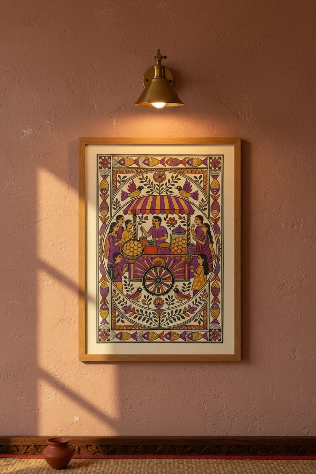
DESIGN BRIEF: The brief was not to paste a food-blog cart inside a decorative Indian frame — it was to solve how Delhi chaat culture reads inside Mithila central-medallion grammar without breaking Bharni flat-fill discipline. Pani puri is a radial ritual: vendor at centre, hands reaching in from every direction, puri spheres as repeated bindu dots, spiced water as the liquid offering. Central-medallion symmetry solves that layout problem: the circular street-cart scene becomes the mandala nucleus the way a Kohbar lotus once anchored a wedding wall, while the rectangular fish border stays formally balanced like classical Aripana enclosure. Bharni made sense because puri spheres, canopy stripes, and customer sarees need readable flat silhouettes at poster distance; Kachni hatching stays reserved for fish scales, leaf veins, and clothing texture where line density can whisper without muddying the spice-colour fields. We stacked the wicker basket and glass jar as folk still-life props, colour-coded the crowd in purple-orange-yellow so each eater separates at a glance, and let the vendor's ladle arc into the matka as the single narrative action line — everything else is silhouette orbit. The outer fish band is deliberate matsya grammar, not garnish: street food as abundance, chaat as daily festival.