WALLIMILIST
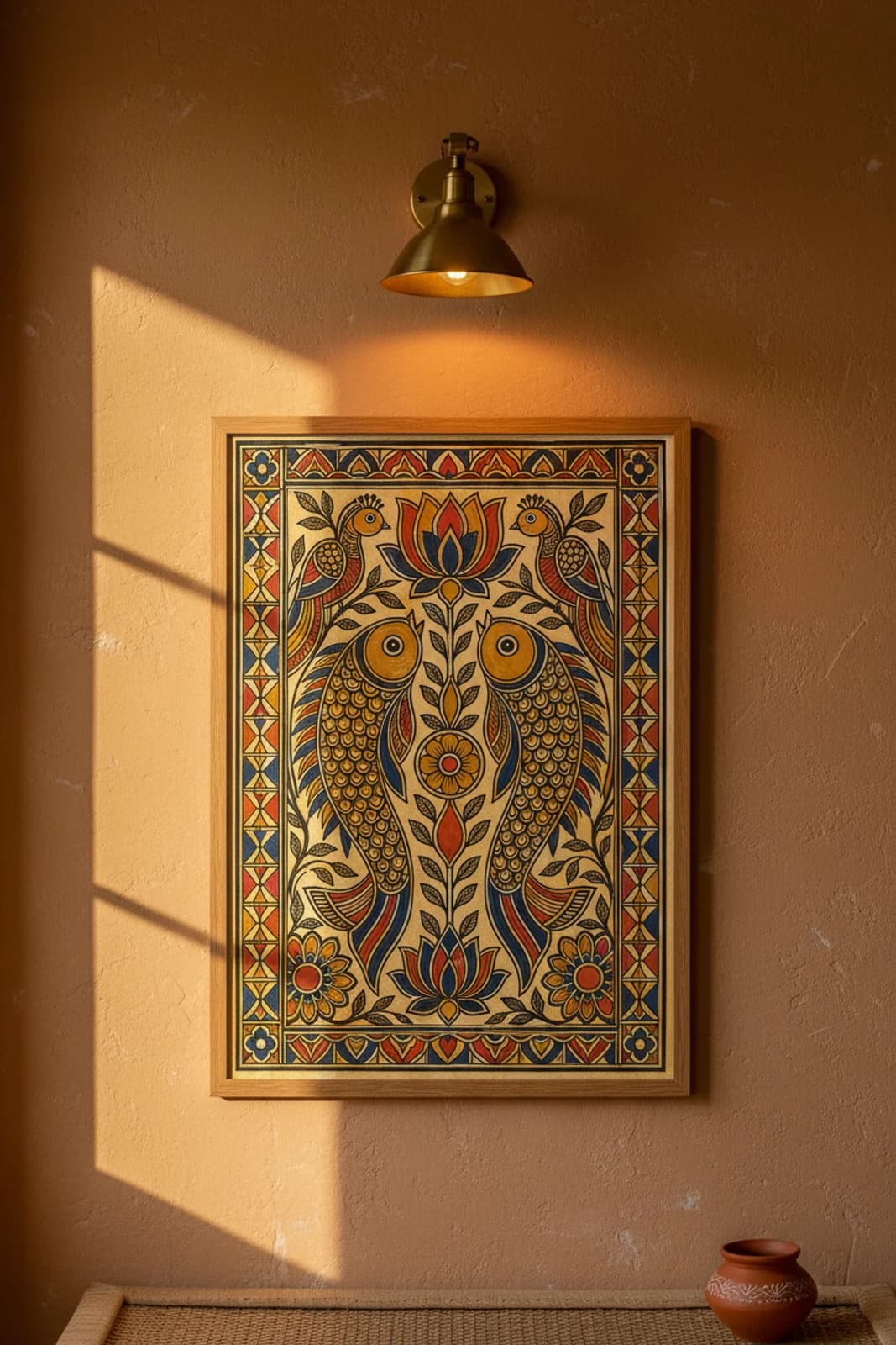
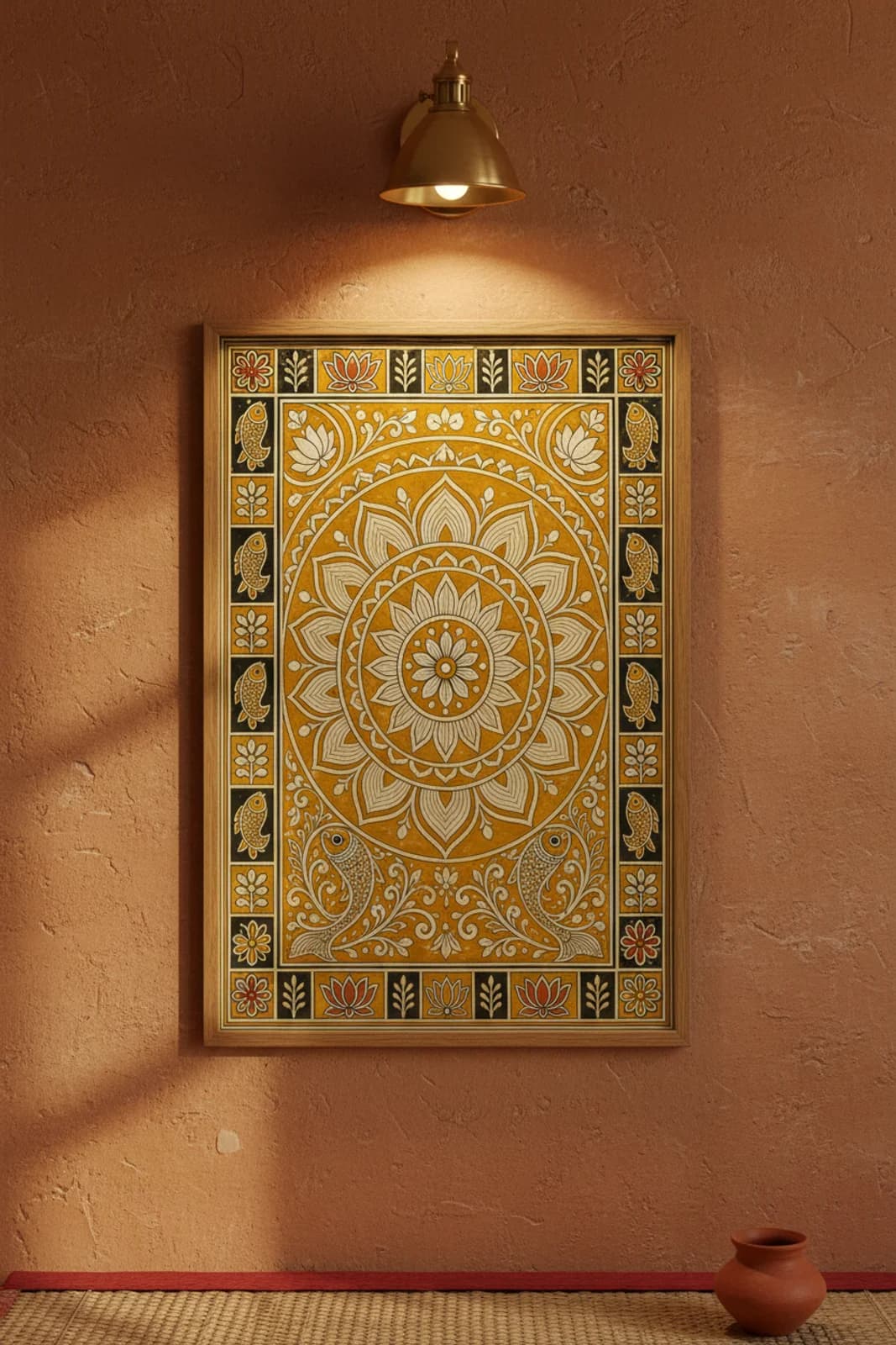
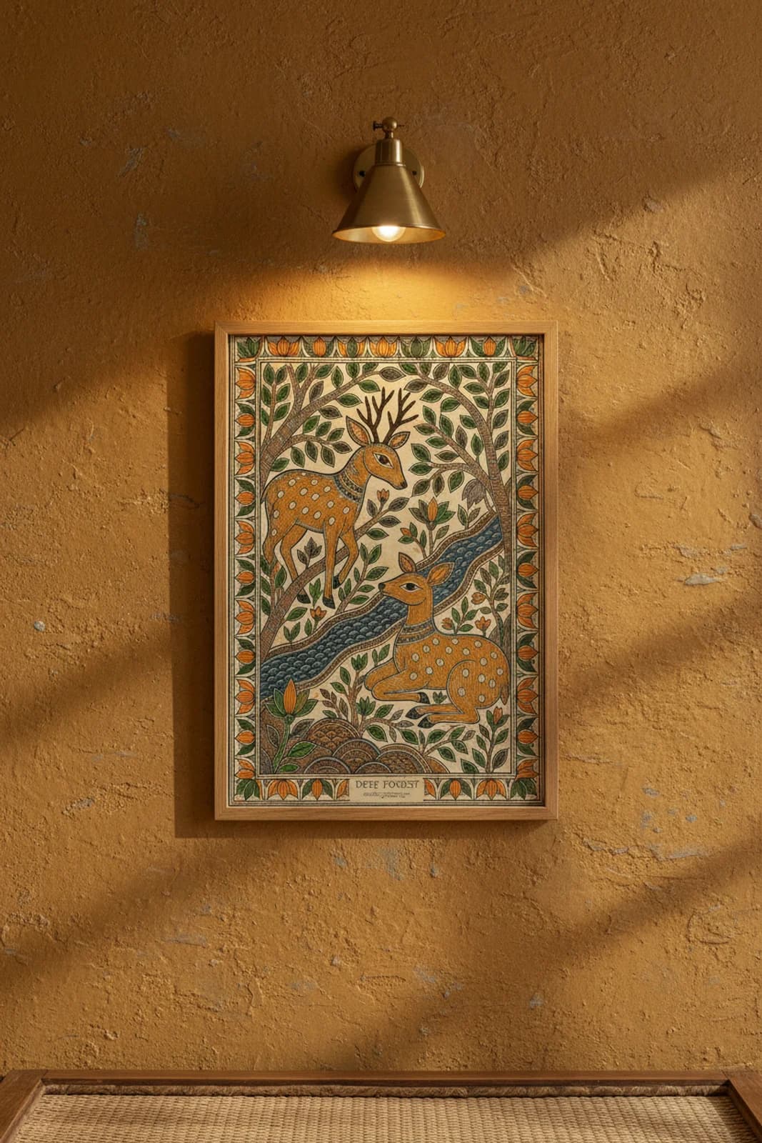
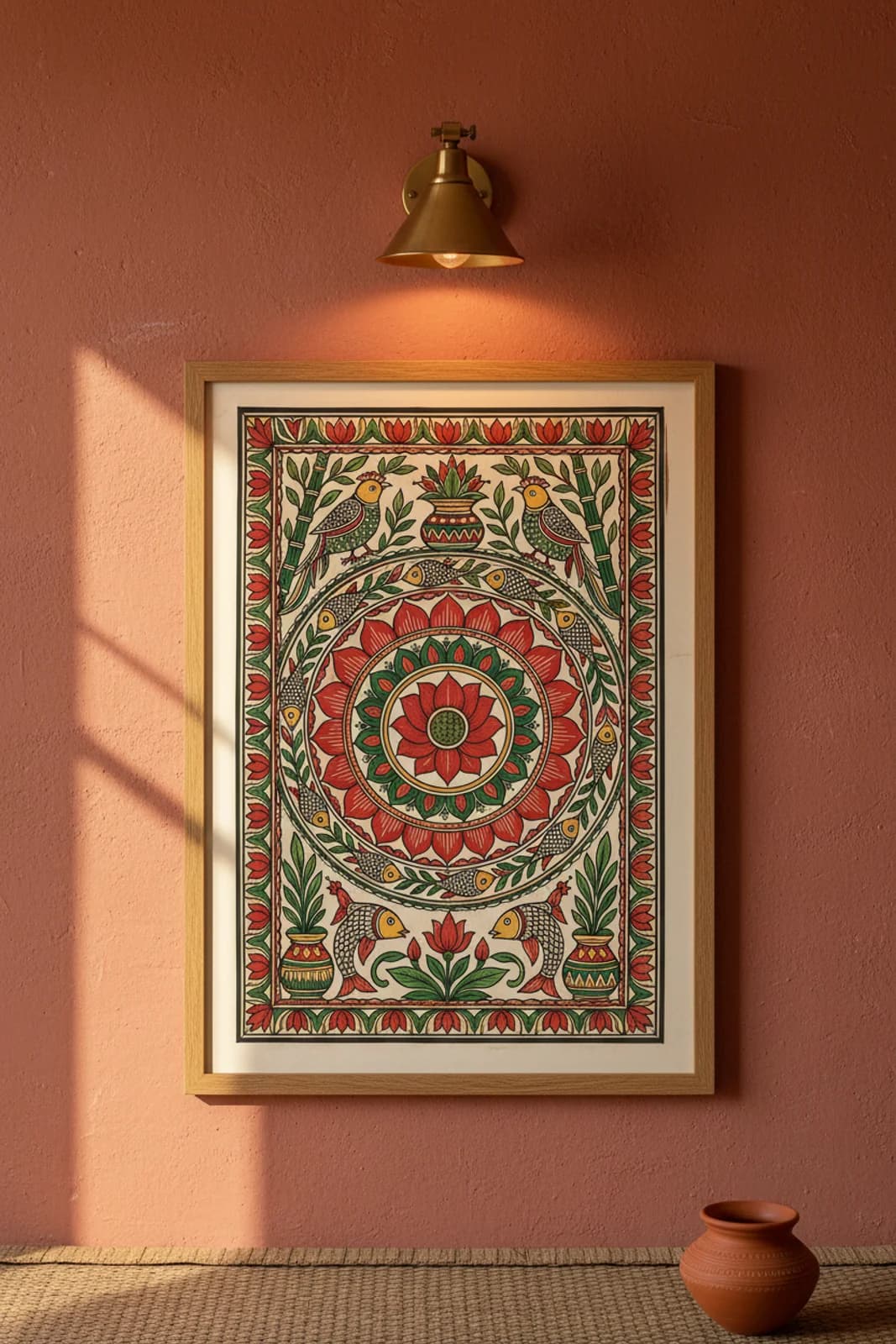
Interior-specification art. Every print is engineered to a wall — palette, proportion, room fit and edition — and made to order on archival fine-art paper.
Follow us on Google- Visa
- Mastercard
- American Express
- Apple Pay
- Google Pay
- PhonePe · UPI
- Paytm · UPI
- SSL Encrypted
- Secure Checkout
- Worldwide Shipping
- Easy Returns
© 2026 Wallimilist. Archival prints made to order.
Original artwork, designed in-house — independent interpretations, not affiliated with or endorsed by any brand or rights holder.