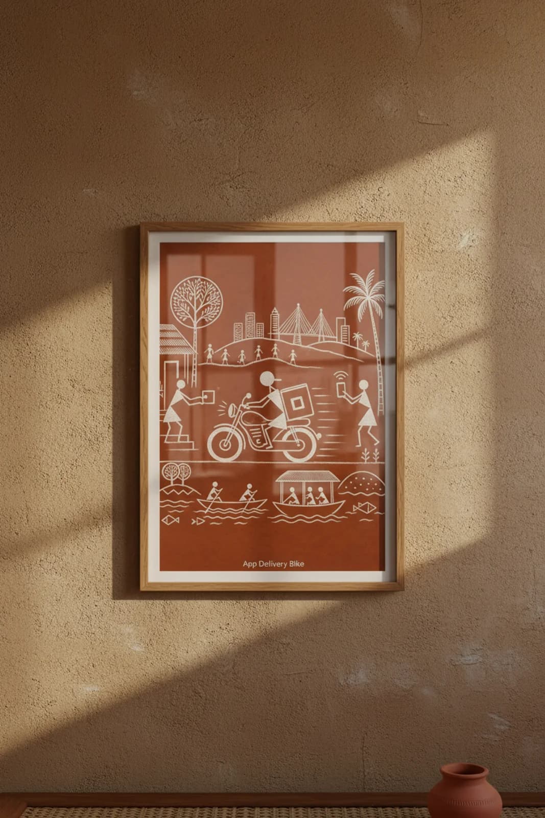
The brief was a translation problem, not a tourist poster: how does a Swiggy-era delivery motorcycle — branded bag, headlight glare, app ping — read inside Warli white-line grammar without breaking the monochrome discipline or smuggling in a tarpa dance spiral? Horizontal-band symmetry was the layout fix. The gig economy moves on a flat road band, not a ritual circle, so the hero motorcycle cuts left-to-right across the middle register while the upper skyline and lower river hold the vertical frame in three stacked tiers. What we refused: perspective vanishing points, multicolor fills, logo typography, and the concentric dance ring that belongs only on tarpa subjects. What we kept legible: square delivery box echoing square package at the hut door, wifi arcs standing in for the order signal, speed lines as the only motion shorthand, and the Bandra-Worli cable-stayed bridge as Mumbai coastal identity without naming it on canvas. The river boats and walking hill figures anchor the fusion subject in classical village water-and-procession grammar so the piece stays Warli first, app economy second.